Font In Web Design
In the web we keep on listening the word 2.0, accessibility, SEO, well that’s what its all about. The evolution of Web 2.0 was slow but very effective. Now In web design the font which was hardly ever emphasized in the 90’s, is now used with some thought process.

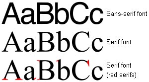
Whether to use Serif (Font the one with little feet) or the Sans-Serif (font with no feet), it all depends on the feel of the site or mixing both fonts to achieve the required affect.

According to Wikipedia
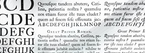
“In typography, serifs are non-structural details on the ends of some of the strokes that make up letters and symbols. A font that has serifs is called a serif font (or serifed font). A font without serifs is called sans-serif, from the French sans, meaning “without”. Some typography sources refer to sans serif typefaces as “grotesque” (in German “grotesk”) or “Gothic,” and serif types as “Roman.” These terms are no longer commonly used however, except in specific font names.”
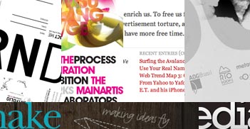
Here are some really nice examples of powerful use of fonts in Web design today.
Some good reads and websites for fonts importance in web design.
A simply written informative article by Stephanie Corrigan
Some other Links.
Font Squirrel
Google Fonts

Great! Thank you very much!
I always wanted to write in my blog something like that. Can I take part of your post to my site?
Of course, I will add backlink?
Regards, Your Reader
Sure, its kind of you to ask first .
No problem.
Your site displays incorrectly in Mozilla, but content excellent! Thanks for your wise words:)
StaictRancy I heard they stop supporting this project …. like on mozilla site they are also pointing towards firefox….
So move on get FF3 😉
wonderful put up, very informative. I ponder
why the other specialists of this sector do not realize this.
You must continue your writing. I’msure, you’ve a great readers’ base already!